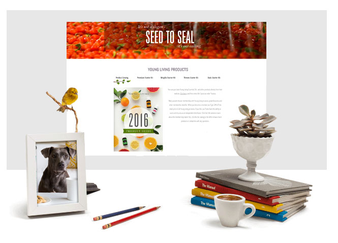
Announcing an all new experience for your Home Page

Attract new visitors.
Keep them engaged.
More Engaging Layout
We’ve completely re-styled the home page to engage your site visitors right from the start. We’ve added tons more content right to your home page, lowering the number of clicks that it takes for your visitors to find information about Young Living and the products that matter most.
More Purpose
The original home page design was built to introduce you to your site visitors. This home page is built to educate users on all that Young Living has to offer, and move them towards further engagement. With more links and popups that will funnel users into signing up for email lists, contacting you and signing up via virtual office.
Capture More Leads
We’ve added 3 new ways to help capture leads so that you can followup and close the sale. The new home page contains a link to encourage signup into our “curious” email series, a popup delayed 60 seconds to encourage mailing list signups, the ability to capture contact info when a user clicks to “place an order” with Young Living, as well as the standard contact form.
